How Fast Will I Recover?
Patient Recovery Curves
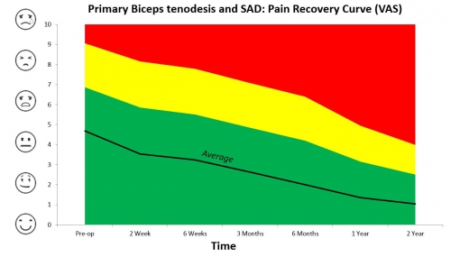
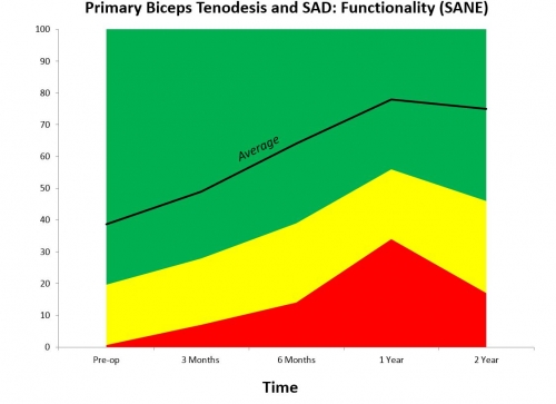
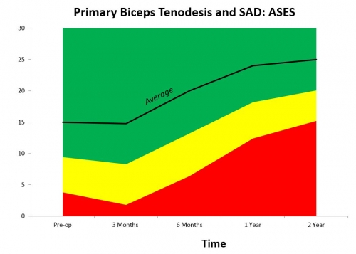
In order to help patients understand the recovery process and to also measure that process, we ask all our patients to participate in a patient-reported outcomes measure (PROMs). This allows us to measure not only the final outcome, but also the process of recovery. This process of recovery is termed “The Recovery Curve” and it is different for each type of operation. We measure three different variables, described below, and present them for Total Shoulder Replacements, Reverse Shoulder Replacements, and Full Thickness Rotator Cuff Tears.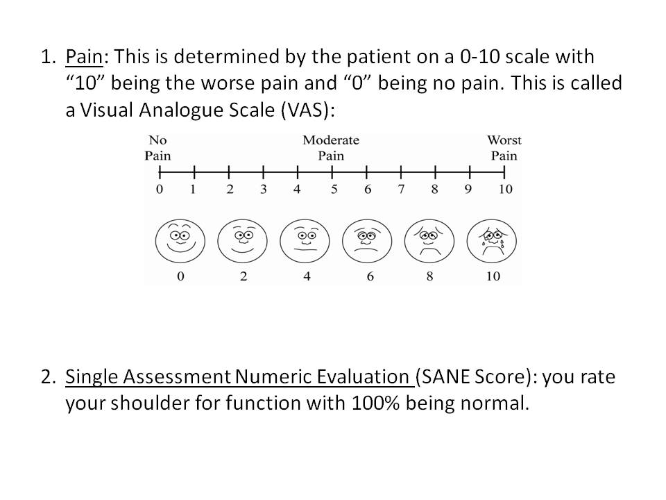
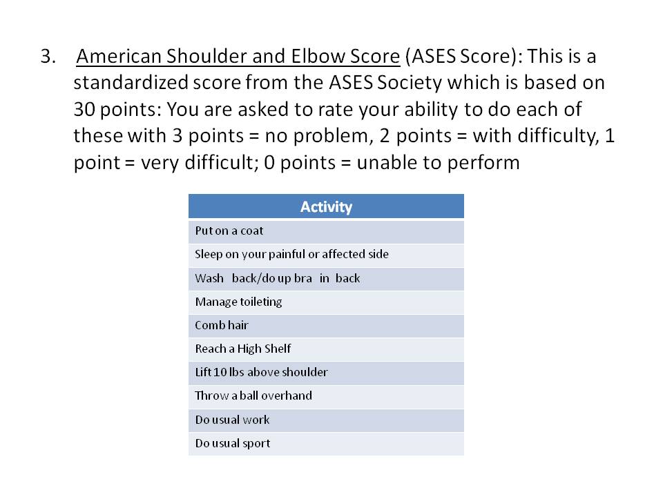
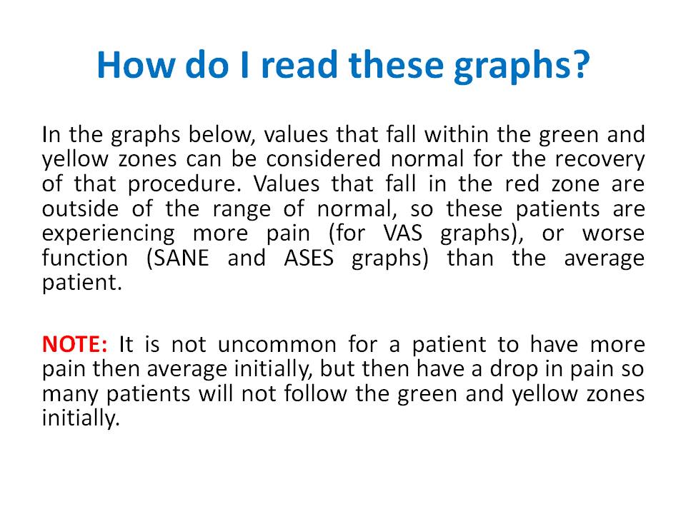
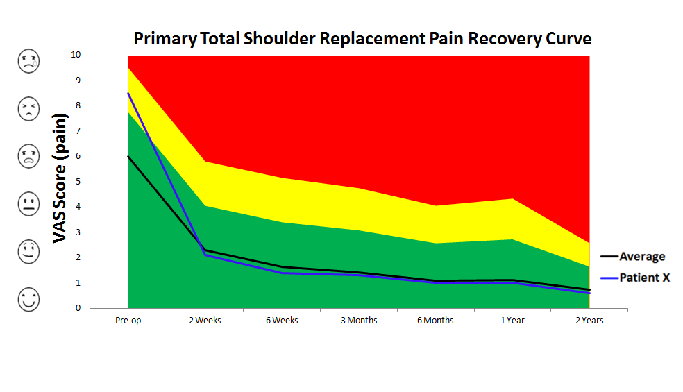
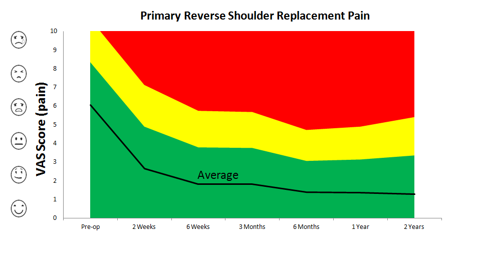
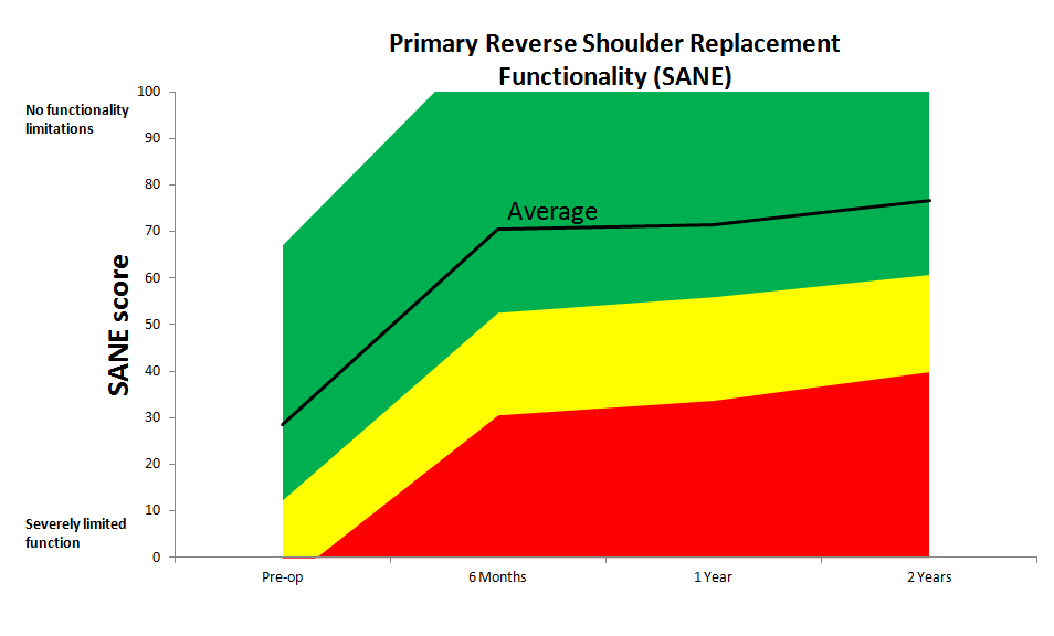
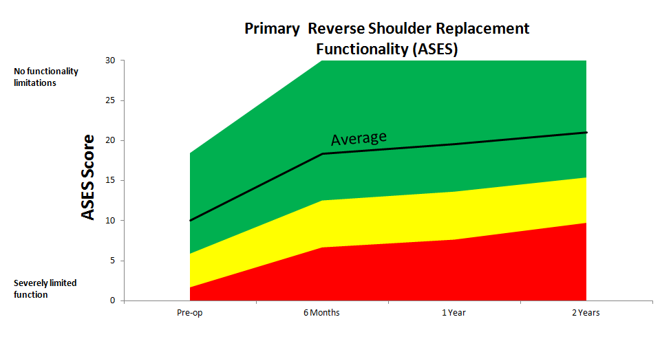
Below you will see graphs depicting pain and function recovery curves. The last graph is an example of how an individual patient’s pain recovery could be compared to the average recovery curves.
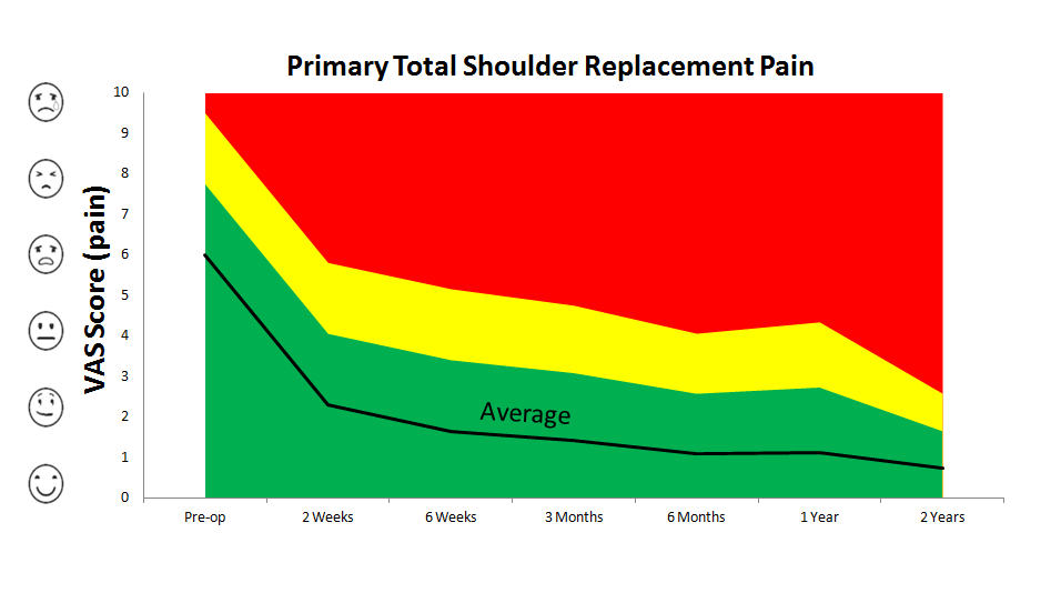
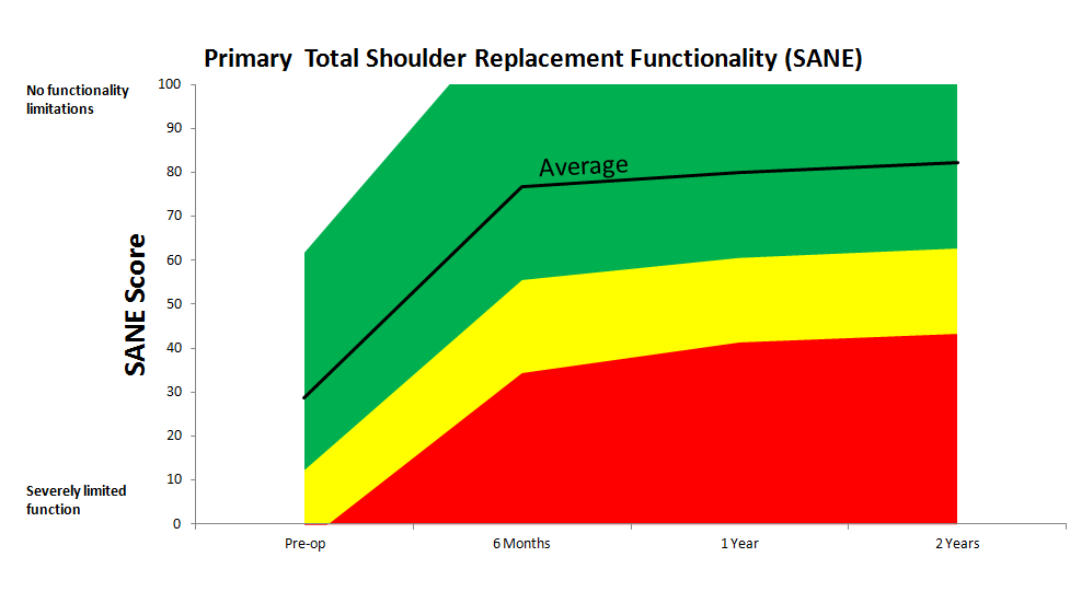
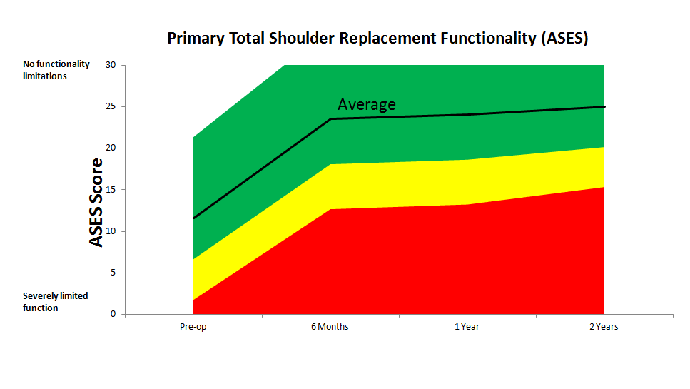
Example Patient X
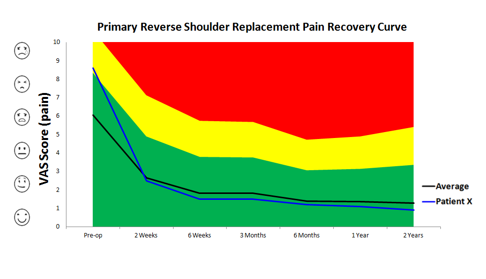
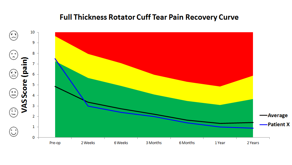
The patient shown below (the blue line) had more pain than average before their surgery (in the yellow zone) and after surgery dropped to below average (in the green zone). Their recovery curve does not follow the average curve exactly, but is a typical example of how an individual recovery curve could look compared to the average.
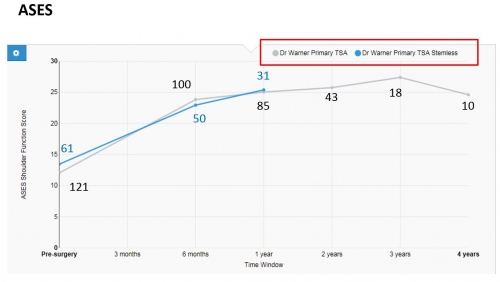
Stemmed vs Stemless
Below are the pain and function recovery curves. Each time point has the number of completed surveys.
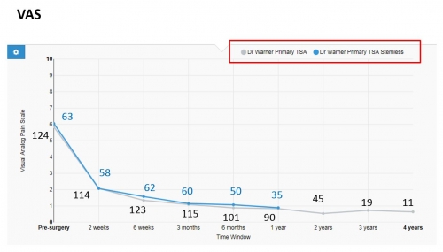
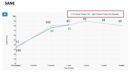
Below you will see graphs depicting pain and function recovery curves. The last graph is an example of how an individual patient’s pain recovery could be compared to the average recovery curves.
Example Patient X
The patient shown below (the blue line) had more pain than average before their surgery (in the yellow zone) and after surgery dropped to below average (in the green zone). Their recovery curve does not follow the average curve exactly, but is a typical example of how an individual recovery curve could look compared to the average.
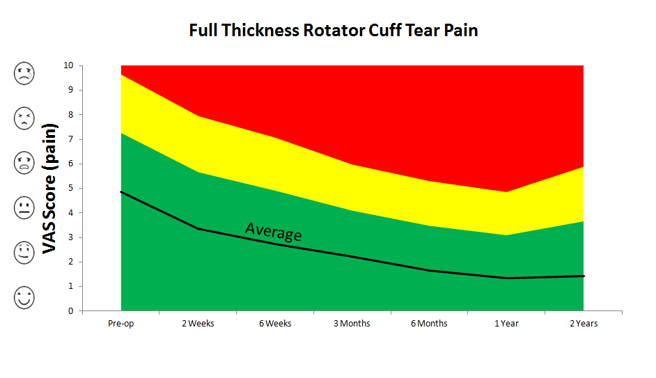
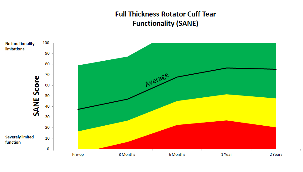
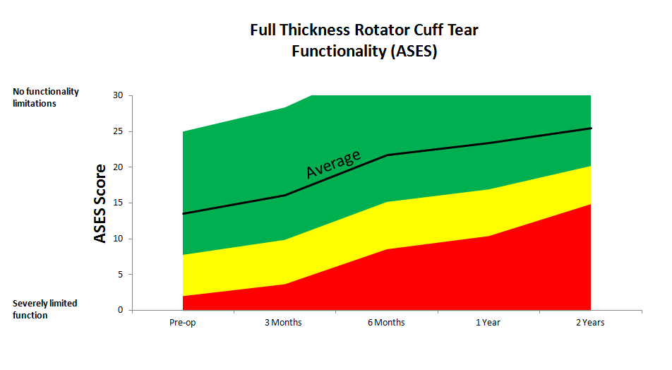
Below you will see graphs depicting pain and function recovery curves. The last graph is an example of how an individual patient’s pain recovery could be compared to the average recovery curves.
Example Patient X
The patient shown below (the blue line) had more pain than average before their surgery (in the yellow zone) and after surgery dropped to below average (in the green zone). Their recovery curve does not follow the average curve exactly, but is a typical example of how an individual recovery curve could look compared to the average.
Below you will see graphs depicting pain and function recovery curves.
